Patiova
A design to invoke trust and convey a sense of modest sophistication
_
The goal for the identity design of Patiova is to immediately invoke trust in the brand and to give people a sense of the market in which it fits.
By not looking cheap we immediately position the brand as above average, delivering a better experience from product purchase, to customer service, to a lifetime of ownership.
While not looking average we need to be careful not to oversell the brand by taking on the look of a luxury furniture manufacturer when in-fact it is more middle of the road.
In summary, Patiova’s personality should appeal to discerning customers who appreciate both value and quality.
Naming +
LOGO +
BRANDING +
The Mood Board
_
Large blocks of medium and dark shades of color lend a sense of modest sophistication.
In this case we have shades of a green and blue gray that support the idea of outdoor products, but don’t scream with vibrant colors that would be unfitting for a medium to higher end brand.
Complimenting the unassuming color palette is a sans-serif font in uppercase that is contemporary yet refined. It can be paired with a serif font to maintain the impression of an established and credible brand.
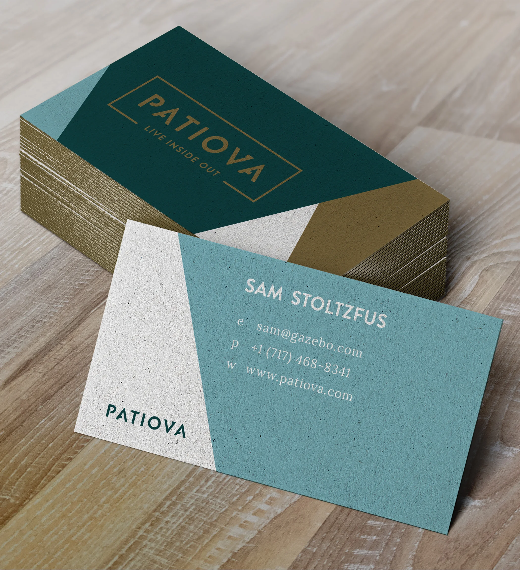
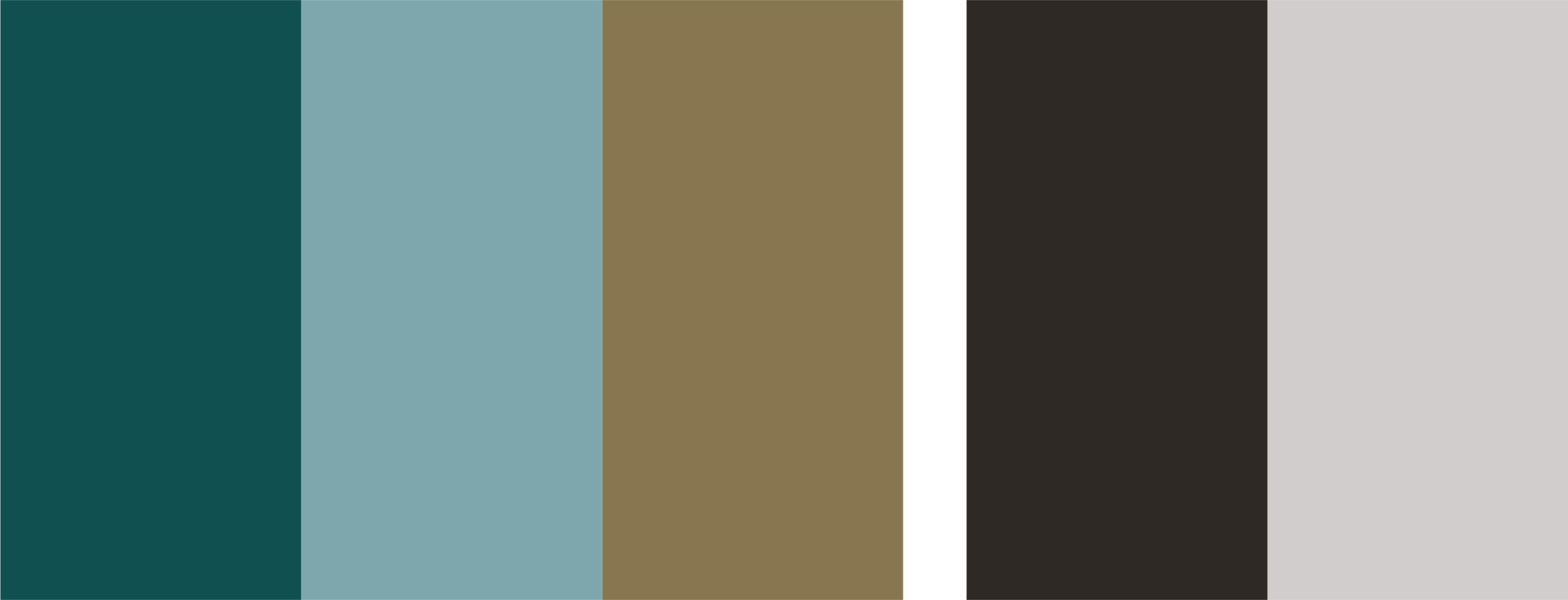
The Color Palette
_
This color palette was inspired by the mood board, and includes a medium blue green as the primary brand color.
A dusty blue follows on the heels of the darker green and will work in situations where a lighter, fresher color is needed.
Gold as an accent color will allow for beautiful foil stamps in print design.
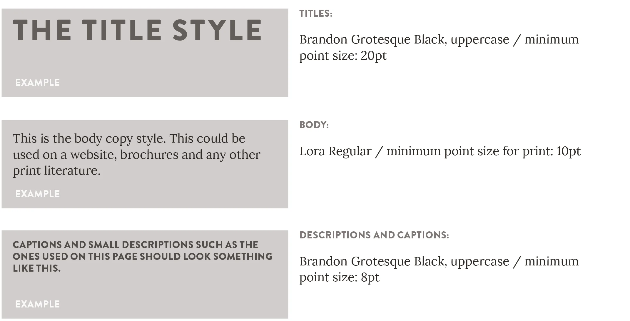
The Font Style
_
The choice to use a sans serif font for the main logo type was intentional.
When creating a medium to high end brand, it’s possible to lose fresh, modern and artistic perspective. Sans serif fonts bring in those elements that are much needed.
To balance out the Sans Serif font in the main logo type I’ve used a serif font for all the body copy. I wanted to portray some of the richness and business integrity that would be associated with a brand that has been around for a long time. A serif font does such a good job of that. The two font styles work together to create a beautiful, eye catching visual identity.
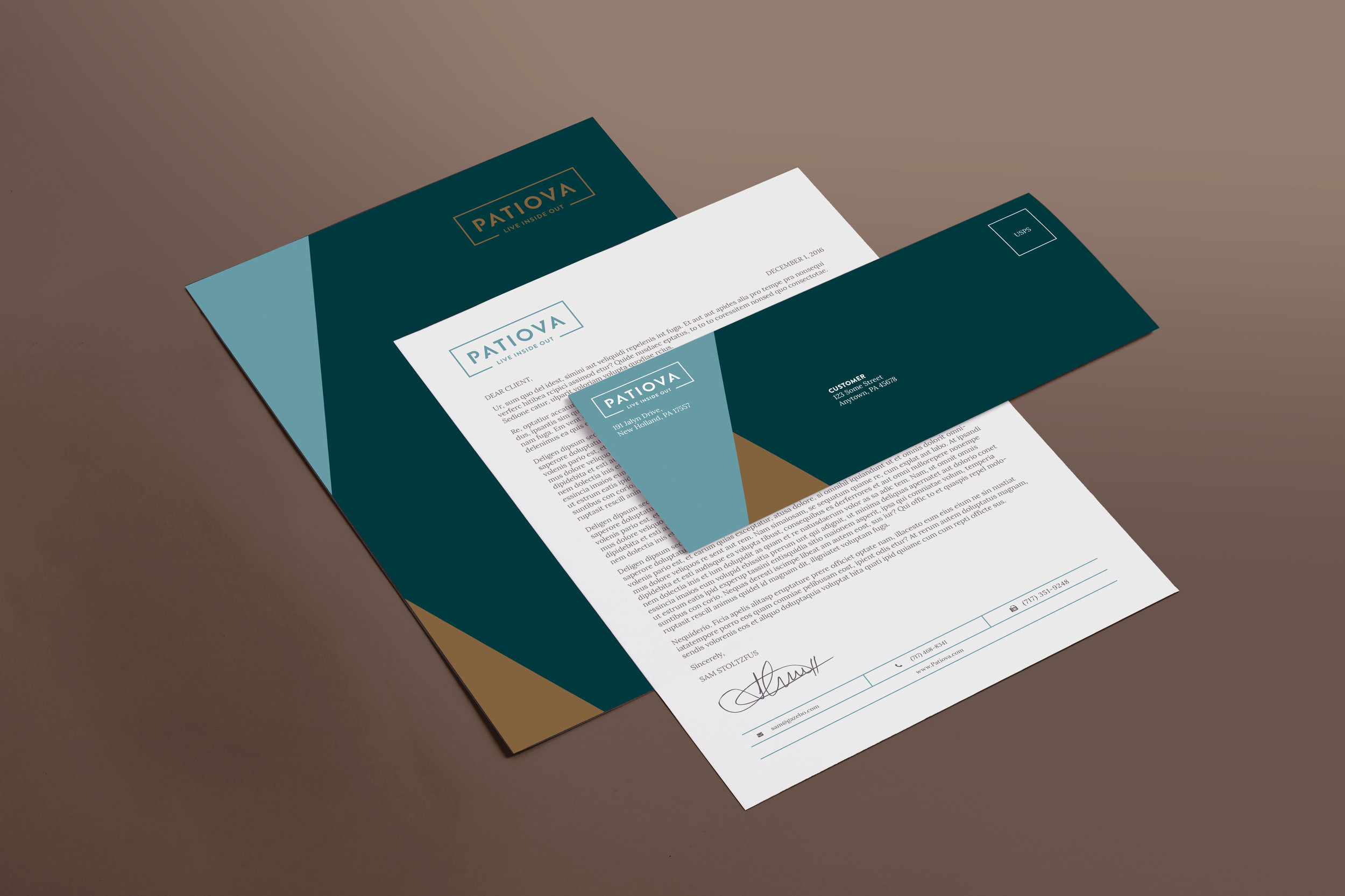
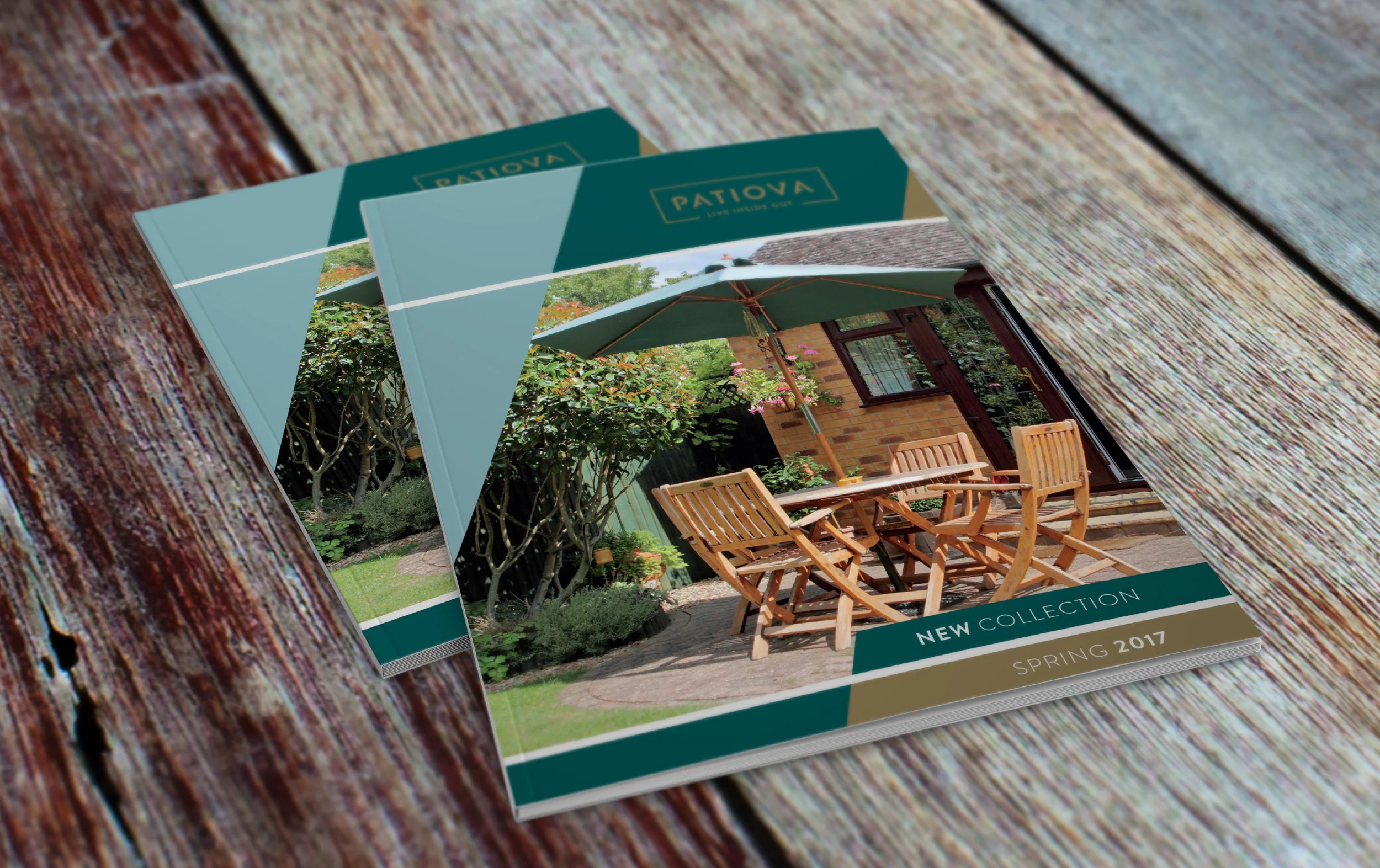
Applied Design
_
The angled lines are taken from a common theme in the logotype and provides a wealth of design layout possibilities.